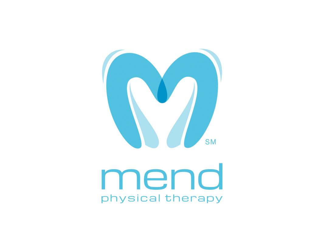
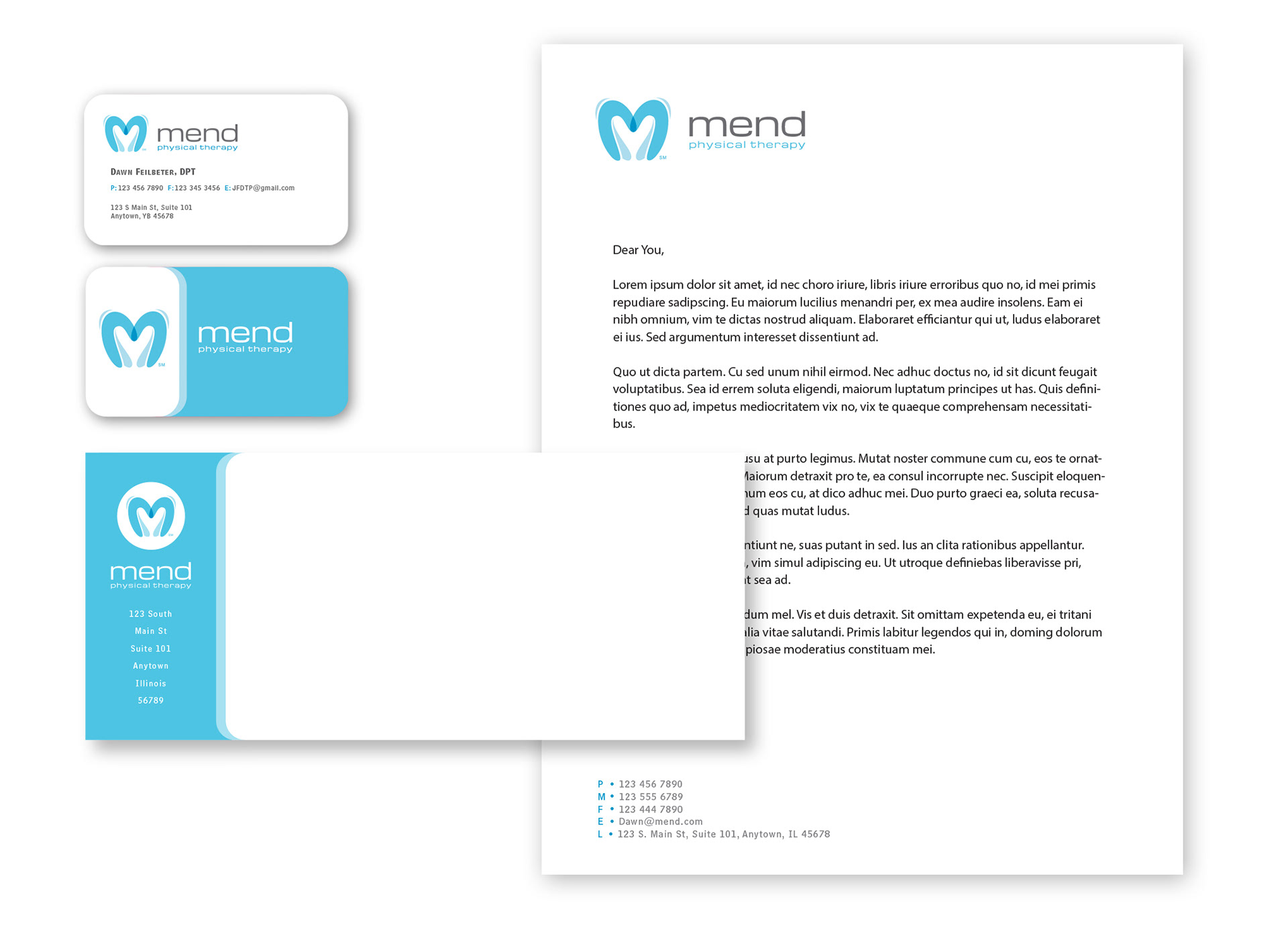
This was an identity assignment for a new physical therapy company specializing in women's pelvic health. The “M” was designed to represent the care and nurtured approach Mend provides their patients delivered in a sleek modern design. Blue tones were used to instill a sense of calm yet invoke quality care.
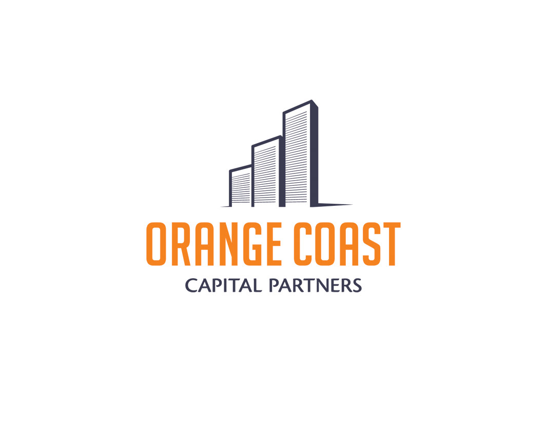
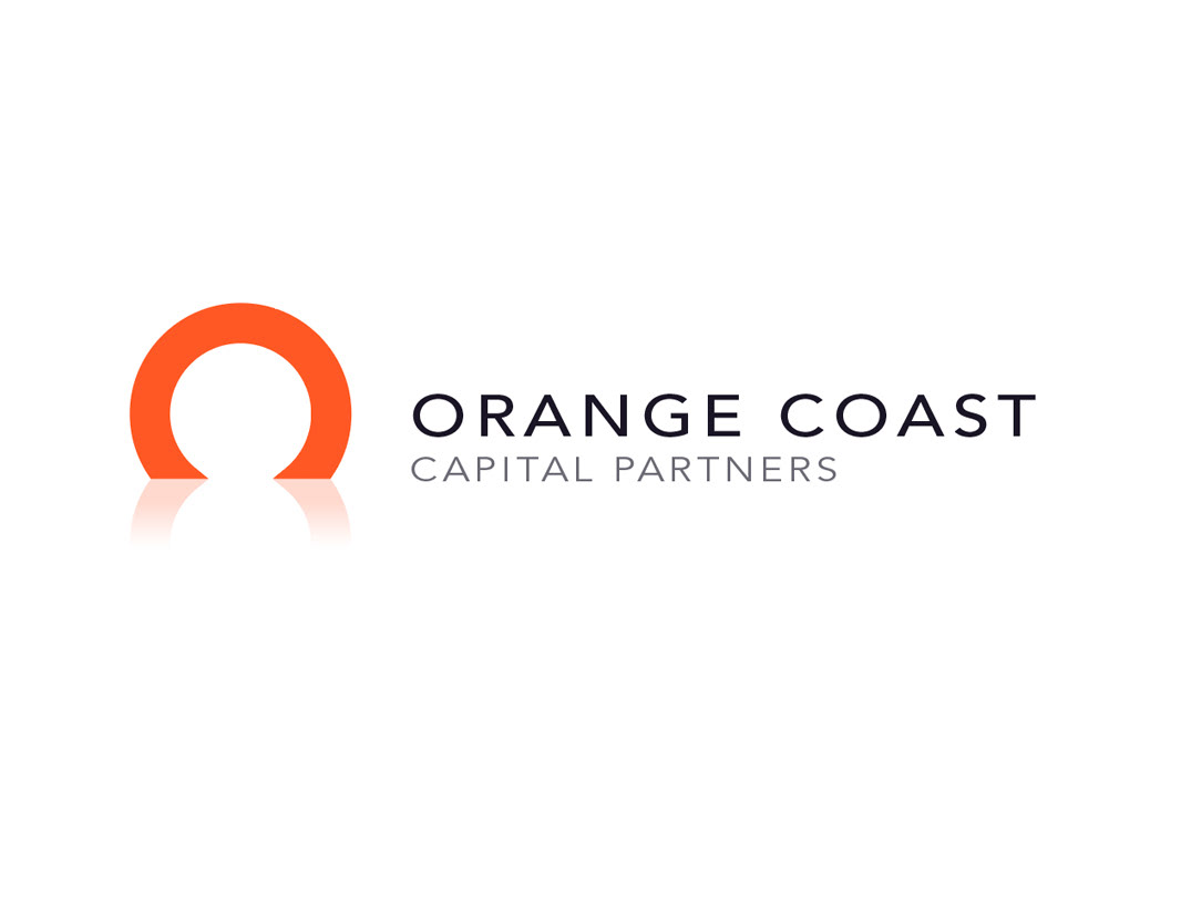
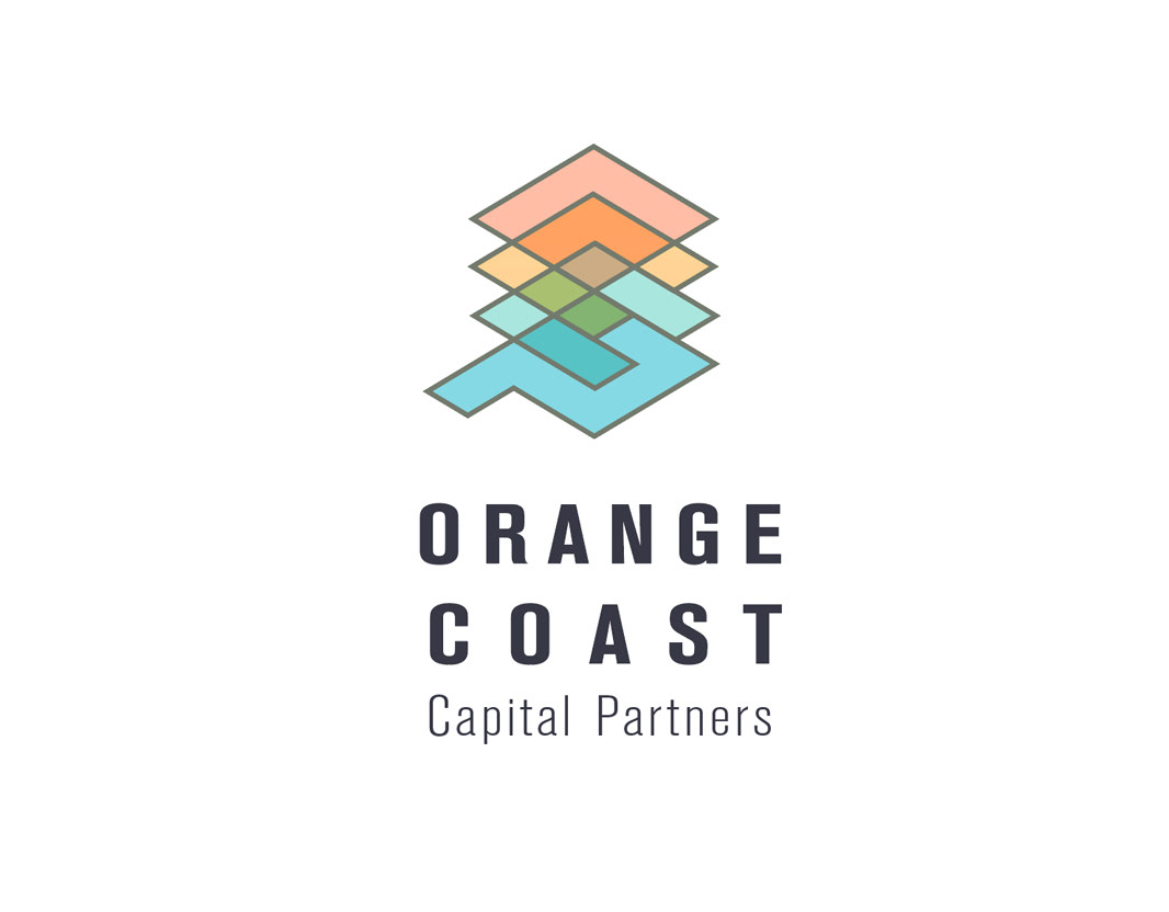
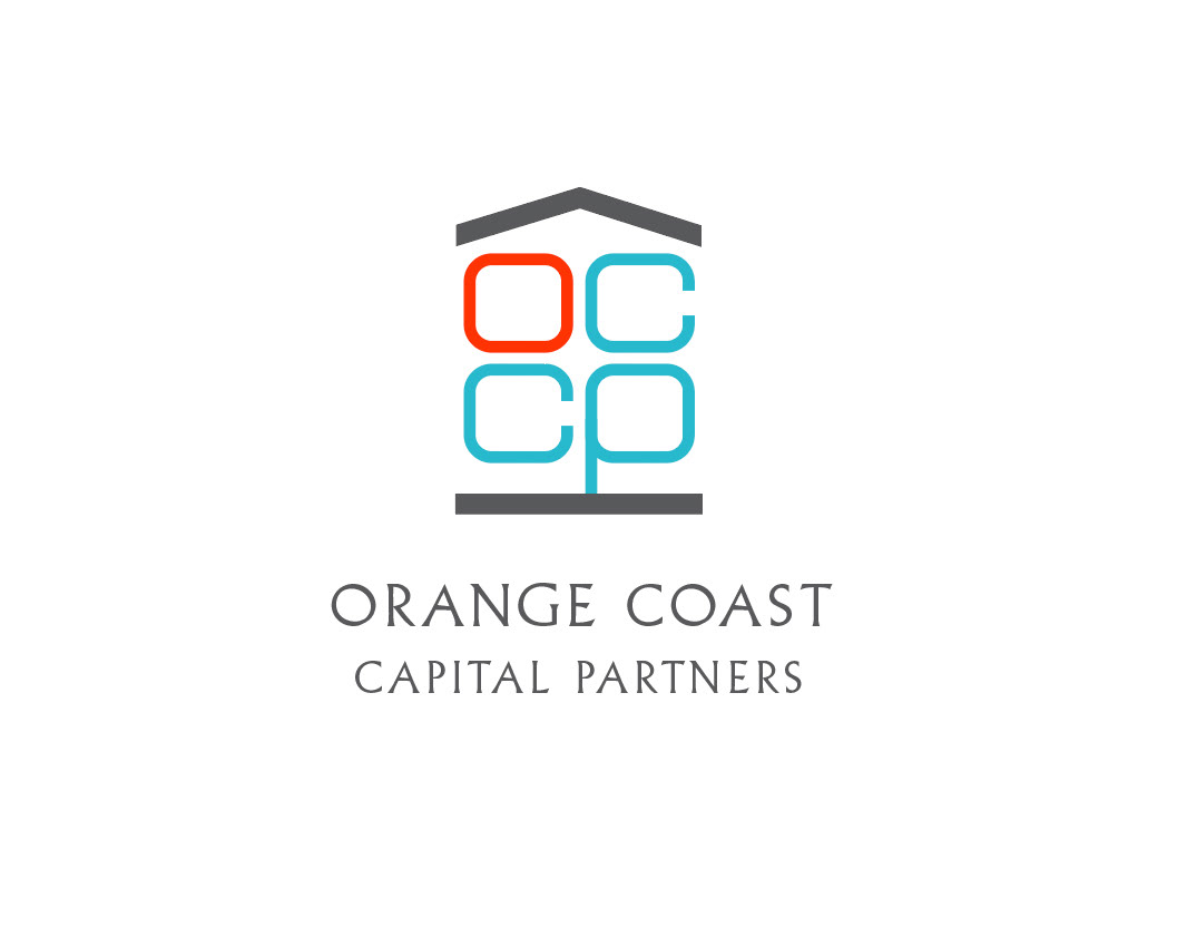
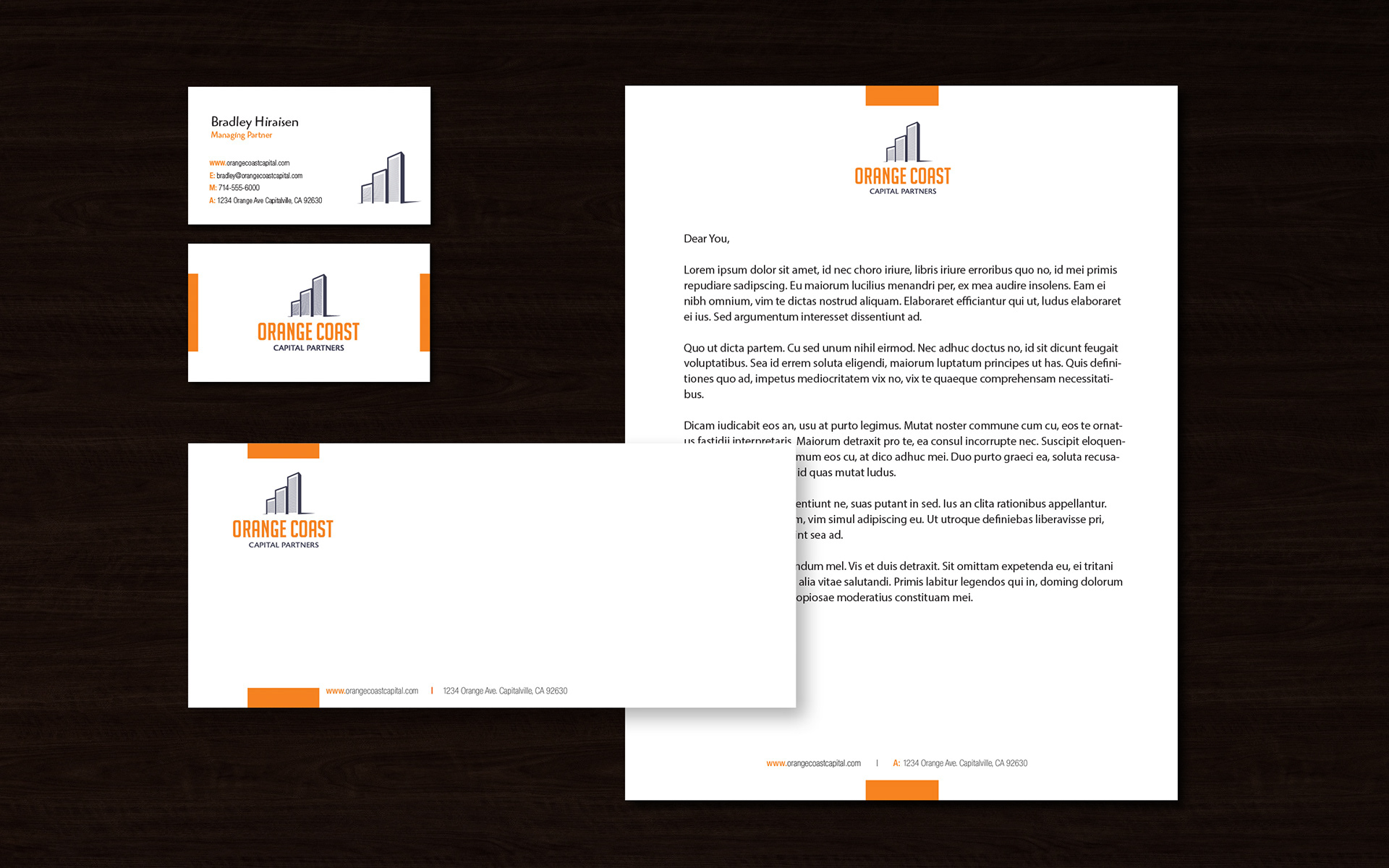
California based Orange Coast Capital Partners contacted me to develop their new identity for their start up business in real estate investments. I applied structural elements to double as a visual cue for the real estate business, but also symbolize a bar graph to represent financial growth and strength. Playful and approachable sans-serif font was used to minimize the stuffiness associated with financial firms, yet offer strength, stability and confidence to future investors.
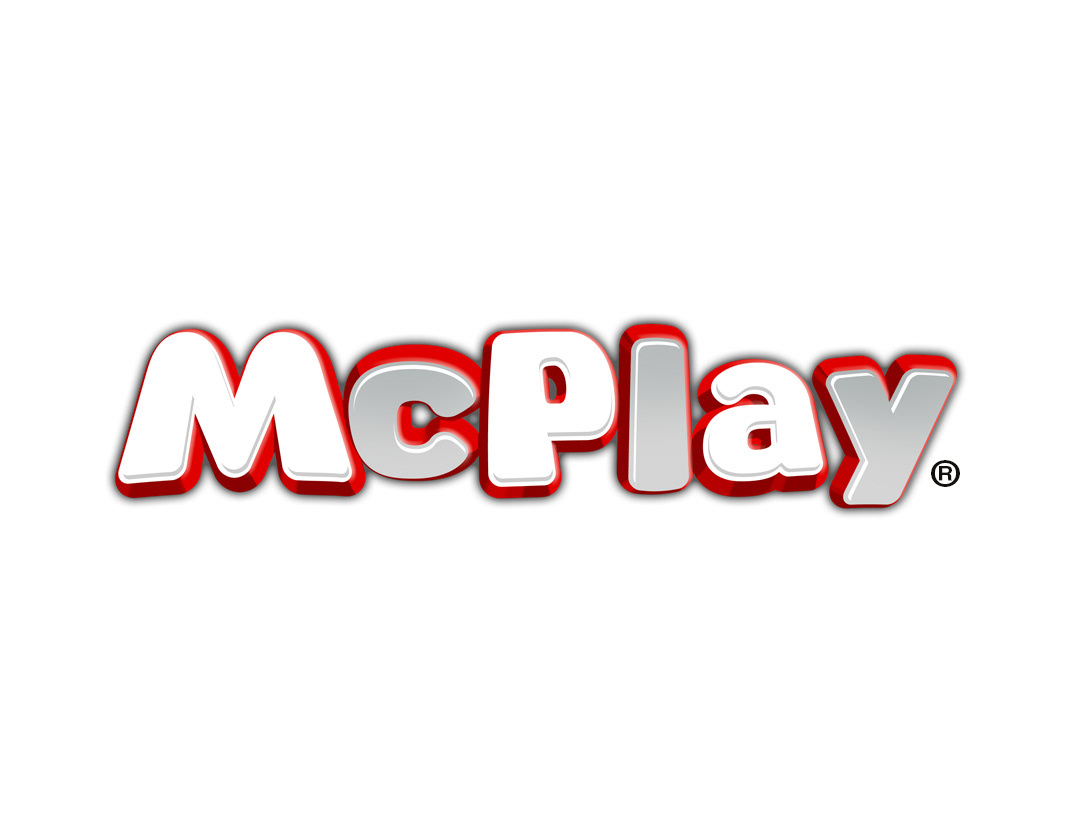
When creating the identity for the McDonald’s kids targeted app, we needed to establish a name for the app, but also the name for the scanning function within the app.
Choosing “McPlay” instantly associated the app as a McDonald’s experience while tipping and tilting the font was a nod to the playful nature consumers would expect from a McDonald’s experience.
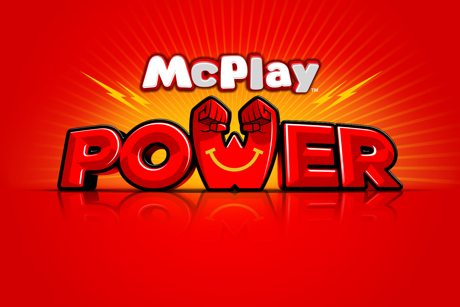
“McPlay Power” was used to communicate object recongnition technology available in McPlay. Each Happy Meal toy could unlock game content within McPlay, an industry leading function.
Additional Logo Examples